This post was originally published on May 5, 2010. The original can be found here.
The state of media players on Linux is a sad one indeed. If you’re a platform enthusiast, you may want to cover your ears and scream “la-la-la-la” while reading this article, because it will likely offend your sensibilities. In fact, the very idea behind this series is to shake up the freetards’ world view, and to make them realize that a decent Winamp or iTunes clone need not be the end of the story for media management and playback on Linux.
This article will concentrate on lambasting Rhythmbox, the default jukebox software of the GNOME desktop environment. Subsequent posts will give the same treatment to other players in this sphere, including Banshee, Amarok, and Songbird (if I can find a copy that will still build on Linux). If you’re a user of media players on Linux, keep your own annoyances firmly in mind, and if I don’t mention them, please share in the comments. If you’re a developer for one of these fine projects, try to keep an open mind and get inspired to do better. A media player is not a hard thing to build, and I do believe that together, we can do better.
For the remainder of this article, please keep in mind that I am currently running Rhythmbox under Kubuntu 9.10, so you’ll see it rendered with qt widgets in all of my screen shots. This doesn’t affect the overall performance of the app, but leads nicely into my first complaint:
- Poor Cross-Platform Support: There are basically two desktop environments that matter in the Linux world, GNOME and KDE. Under GNOME, Rhythmbox has a reasonably nice icon set that is comparable to other media players. Under KDE, the qt re-skinning replaces those icons with a horrible set of mismatched images that really make the program look second-rate:

As you can see, these icons look terrible. Note that there isn’t even an icon for ‘Burn’ and the icon for ‘Browse’ is a fucking question mark. This extends to the CD burning and help features too. They rely on programs like gnome-help and brasero to work, but don’t install them with the media player, so when I try to access these features under KDE, I just get error messages. Nice.

This is just plain stupid. Every package manager has the concept of dependencies, so why doesn’t Rhythmbox use them? - The Player Starts in the Tray: Under what circumstances would it be considered useful for a media player to automatically minimize itself to the system tray on startup? It doesn’t begin to play automatically. The first thing that I always do is click on the tray icon to maximize it so that I can select some music to start playing. Way to start the user experience off on the wrong foot.
- Missing Files View: This one is just plain stupid. Whenever I delete a file from my hard drive, it shows up under the ‘Missing Files’ view, even though my intent was clearly to remove the file from my library. Further, I use Rhythmbox to put music on my BlackBerry. Whenever I fill it with music, I first delete the files on it. Those files that I deleted from my mobile device? Yeah, they show up under ‘Missing Files’ too, as if they were a legitimate part of my library! So this view ends up being like a global garbage bin that I have to waste my precious time emptying on occasion, and serves no useful purpose in the mean time. Yeah, I deleted those files. What are you going to do about it?

As you can see, I’ve highlighted the fact that Rhythmbox is telling me that these files are missing from my mobile device. No shit. - Shared Libraries that I can’t Play: So we’ve known for awhile now that Apple broke the ability to connect to iTunes via the DAAP protocol, and that it’s not possible to connect to a shared iTunes library from Linux. If that’s the case, why does Rhythmbox still show these libraries as available? And how come it shows my library under this node? Why would I listen to my own shared library? Finally, I’ve found that even if I’m running Rhythmbox on another machine, I still can’t connect to my shared library. This feature seems to be downright broken – so why is it still in the build?
- The GUI and Backend are on One Thread: I keep about half of my music collection as lossless FLAC files. When I want to rip these files to my portable media device, they need to be converted to the Mp3 format. Turns out that Rhythmbox thinks it appropriate to transcode these files on the same thread that it uses to update its GUI, so that while this process is taking place, the app becomes laggy, and at times, downright unusable. Further, the application doesn’t seem to give me any control over the bitrate that my songs are transcoded to. Fuck!
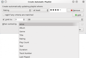
- Lack of Playlist Options: Smart playlists in Rhythmbox are missing a rather key feature: Randomness. When filling the aforementioned mobile device with music, I would like to select a random 4GB of music from my top rated playlist. But I can’t. I can select 4GB of music by most every criteria except randomness, which means that I get the same 600 or so songs on my device every time I fill it. This is strange, because I can shuffle the contents of a static playlist; But I cannot randomly fill a smart playlist. Great.

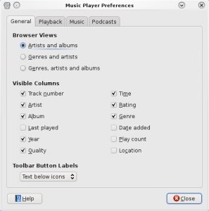
It’s funny; I really want to like Rhythmbox, but it’s shit like this that ruins the experience for me - Columns: What the fuck. Who wrote this part of the application? When I choose the columns that are visible in the main window, I can’t re-order them. That’s right. So the only order that I can put my columns in is Track, Title, Genre, Artist, Album, Year, Time, Quality, Rating. Can’t reorder them at all, and I have to go into the preferences menu to choose which ones are displayed, instead of being able to right-click on the column headers to select them like I can in every other program written in the last 10 years. This is just ridiculous. I know that the GTK+ toolkit allows you to create re-order-able columns, because I’ve seen it done.

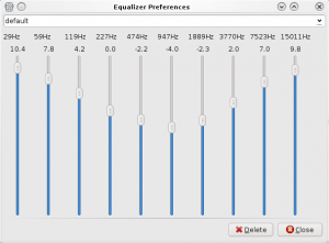
Why, for the love of God, can’t these be re-ordered? - The Equalizer is Balls: No presets, and no preamp. So I can set the EQ, and my settings are magically saved, but I can only have one setting, because there doesn’t appear to be a way to create multiple profiles. And louder music sounds like balls, because I can’t turn down the preamp, so I get digital distortion throughout my signal. It would be better to just not have an equalizer at all.

I mean, it works. But… - Context Menus Don’t Make Sense: Let’s just take a look at this context menu for a moment. There are three ways to remove a song from a playlist. You can Remove the song, which just removes it from the playlist, but not from your library or your hard drive. Alternatively, you can select Move to Trash, which does what you might expect – it removes the song from the playlist, the library, and your computer. I’ve got a problem with the naming conventions here. The purpose of Remove isn’t well explained, and confused the hell out of me at first. In addition, when browsing a mobile device that you’ve filled with music, the GUI breaks down even further. In this case, you can still hit Remove, which seems to remove the song from Rhythmbox’s listing, but leaves the file on the device. So now I have a file on my device that I can’t access. Great. The right-click menu also has the ability to copy and cut the song, even though there is no immediately obvious way to paste it. For that functionality, you’ll have to head up to the Edit menu.

I’m starting to run out of anger. The 10,000 papercuts that come along with this app are making me numb to it. - No Command Line Tools: Now, normally, this wouldn’t bother me too much. A music library is something that’s meant to have a GUI, and doesn’t generally lend itself to working from the command line. In this case however, command line access to Rhythmbox would be really handy, because I’d like to set up a hot key on my keyboard that will skip songs or pause playback. Unfortunately, there’s no way to do that within the software, and it doesn’t have any command line arguments that I can call instead. Balls.
There you have it, 10 things that really ruin the Rhythmbox experience. While using this piece of software, I felt like the developers worked really hard to build something that was sort of comparable to Apple’s iTunes, and then stopped trying. That isn’t good enough! If we want to attract users to our platform of choice, and keep them here, we need to give them reasons to check it out, and even more to stick around. If I say to you that I want to have the best Linux media player, you tend to put the emphasis on the word Linux. Why not just make the best media player? GNOME is on at least half of all Linux desktops, if not more. Why hinder it with software that gives people a poor first impression of what Linux is capable of? Seriously guys, let’s step it up.

Leave a Reply