Ding! Let the fight begin.
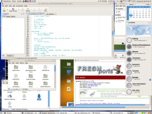
In one corner, we have the only desktop environment I’ve used in Linux – Gnome 2.26, the standard for Ubuntu (the distribution with which I’ve worked the most so far) and Fedora, the distribution I’ve chosen for this experiment.

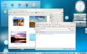
In the other corner, we have newly announced heavyweight KDE 4.3, supposedly with all sorts of social networking integration and enough shiny parts to attract a magpie.

I’m not going to lie. Both environments look pretty gorgeous, but KDE to me – though I’ve used Gnome more in Linux – looks (from screenshots at least) a little more familiar. So what do they have to offer me? Let’s find out!
History
Both environments have a rich history behind them. KDE-ONE was released back in 1997, a little more than twelve years ago today. Gnome followed not long after, in March of 1999.
Gnome started in response to KDE’s not being completely under the GPL; two projects were started as to address this, and Gnome was born. Whereas Gnome – and yes, the ‘G’ in there stands for GNU – started as a completely-GPL response to KDE, KDE in itself was started by a university student troubled by parts of the standard Unix desktop.
Long story short? Both environments got their starts early, and for different reasons. I respect both of their reasons for why and how they started, but I won’t let those get in the way of what I came her to do.
Functionality and usability
(credit to the main websites of both Gnome and KDE)
As I mentioned before, I’m all ready familiar with the Gnome desktop environment. To me, as a hardcore Windows user it was easy to use, intuitive and fairly well laid-out.
Gnome’s newest version includes improvements to its disc burning software and file sharing. File sharing in itself is rather important to me, due to my Windows Home Server containing the vast majority of my digital media.
There are a few other changes – things like the volume manager and Evolution notes client (though I all ready plan on using Thunderbird as I do in Windows), but nothing that particularly caught my eye.
KDE 4.3.0, as a major release, brings home a huge amount of firepower. Full web integration has been brought straight to the desktop. Along the lines of file management, Dolphin seems to offer a lot of the nice previews I’ve come to enjoy with my Release Candidate edition of Windows 7 – file previews in a folder, along with video thumbnails to let me know just what I’m going to be watching (VERY YES).
The System Tray has been completely re-vamped, which I understand could be a nice difference from Gnome (whose system tray hasn’t changed much in the last few updates).
The story thus far
Well, given my complete inability to effectively compare two things and document my findings, not much has been told here so far. Both environments have a rich history and huge amounts of features to offer, and having only used Gnome so far I really can’t say much for KDE other than that ‘it looks nice and sounds nicer’.
…if you have any suggestions on either one, or would like to offer your own experiences here, please do so! At this point, I think I’m leaning more towards KDE’s major 4.3.0 release. Mostly for the shiny things, and partly for wanting to try something new. I’m bored of Gnome.

Allow me to share my limited experience with both. Before I begin though let me start by saying, like you, the vast majority of my experience has been with GNOME. I have only briefly touched other desktop environments like KDE and Xfce. That being said here is how I see the difference between the two:
GNOME: whether this was intentional or not, GNOME seems to take a lot of its interface placement from Apple’s Mac operating system. GNOME is a very light feeling environment that easily organizes things into a very logical menu system. My first time using GNOME was very easy thanks to this.
KDE: unlike GNOME, KDE seems to take its influence from Microsoft’s Windows operating system. KDE is a very flashy, very nice looking desktop environment that has a lot of potential.
Personally, at least from my limited experience, I tend to prefer GNOME. I find KDE to be a little clunky, and it’s ‘start menu’ is somewhat confusing. GNOME is far more boring than KDE but it also seems far more straightforward.
That being said I may still end up going with KDE just because I know so little about it. After all isn’t that what this experiment is about?
Some light reading for those interested:
KDE vs. GNOME
KDE vs. GNOME (2 years later retrospective)
KDE vs. GNOME Download Habits