As noted in my previous post I have decided to try out a mini experiment wherein I test out three recently released distributions (Kubuntu 10.10, Ubuntu 10.10 and Linux Mint Debian Edition) giving each 48 hours to leave me with either a brilliant or terrible first impression. First on the docket was Kubuntu 10.10.
Install
Kubuntu’s installer is absolutely beautiful. It is simple, sleek and gorgeous. As you work your way through the very simple wizard system it begins to copy files in the background which makes the whole install process much faster than in previous iterations. I’m not exaggerating in the least when I say that this is perhaps the best Linux installer I have ever used.
‘New’ Desktop
When I first booted into the desktop I was very pleasantly surprised. I haven’t used KDE since version 4.3 when I had given up on it because, while beautiful and functional, there were just too many rough edges. It seems to be an Internet cliché at this point but I am going to throw it out there anyway: KDE 4.5 is the KDE release you have been waiting for. Most, if not all, of the rough edges that have plagued the 4.x series in the past have been ironed out and replaced with extremely user friendly, soft and presentable windows and options that just make sense.
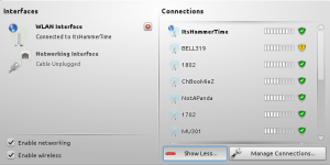
For instance the new network connection interface is stupidly simple. If you can’t figure out how to connect to a network (hint: you just click on it) perhaps you shouldn’t be using a computer in the first place.
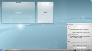
All of these refinements are accented by the new notification system that not only provides a universal area for all program events, but also fixes almost all of my complaints about the previous versions. You can now scroll through the notifications, instead of watching them grow off-screen, and you can even filter by the individual applications that are generating said notifications. Think of it like a unified e-mail inbox versus individual account inboxes.
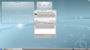
Along similar lines the new, subtle, system tray notifications are simply awesome. Take a look at this screen-shot of the animated file copy indicator.
Its a bit hard to see in the screen-shot but the white pie in the upper right is actually the progress indicator. Unlike in GNOME where you get either a file copy dialog, or a motionless tray icon, I now have no clutter and yet full functionality. You couldn’t make a better system for displaying the information needed. “But what if I want to see more information?†Like everything else, this indicator is fully integrated into the notification system and a single click brings up the progress bar and file copy information. I suppose the point that I’m trying to get across is that this KDE release has done a lot of work in doing away with the clutter that you don’t really care to see 9 times out of 10.
Driver installation is once again handled by jockey, just like in Ubuntu. This time however I had absolutely no issues with it crashing or just not working unexpectedly.
‘New’ Software
I also decided to try out the default software selection to see what had changed. Plus I figured this would be a non-bias way to get a real first impression/feel of the distribution.
Software Management
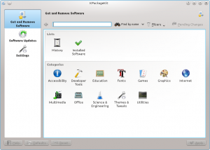
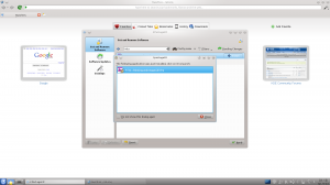
KPackageKit has always been a sore part of (EDIT: the KDE SC) Kubuntu for me. It ‘worked’ but it was far from intuitive, helpful and, sometimes, even useful. The new KPackageKit is an entirely different story. It is far more like a mix between Synaptic and the Ubuntu Software Center and it pulls it off beautifully.
You can now browse by category or search by application (not just package) name. In addition it now also features a list of installed software which is something so painfully obvious that it is hard to believe that this functionality hadn’t existed previously. These three changes alone have completely reinvented KPackageKit in my opinion. I now almost look forward to opening it up to find new software, whereas in previous releases I would go straight to the command line just to avoid it.
Browser
The browser that ships with Kubuntu 10.10 is rekonq 0.6.1, which is essentially a re-spin of Konqueror but instead of using the KHTML rendering engine it uses the faster and more compatible WebKit. While there is nothing overly special about this browser it does feel very Chrome-like and was good enough that I never even bothered to switch to anything else.
One nice thing about it is that it integrates seamlessly into the KWalletManager password store. It also did an excellent job of prompting me to install all of the proprietary codecs so that I could watch YouTube or whatever. The only low point was a lack of a Moonlight plugin but I assume that is probably forthcoming.
Instant Messaging
The default instant messenger is Kopete 1.0.80 which is a fine instant messenger that integrates nicely into the notification system. The real problem with Kopete however is that it simply hasn’t seen nearly as much improvement as the rest of the distribution’s software. If you showed me the Kopete that shipped with KDE 4.3 and the one in KDE 4.5 I couldn’t tell you the difference. From my tests (using the Windows Live Messenger service) I didn’t see anything new. Oddly enough, just like the last time I used Kopete, this version recognizes my laptop’s webcam but there is no option to use it anywhere inside of a chat. Don’t get me wrong, I’m sure a lot of work has been put into Kopete since 4.3 but the problem is I would never know it.
KMail
KMail, now at version 1.13.5, once again takes the e-mail duties for KDE and once again I find it to be far too complicated, cluttered and messy. Sure it is very function and has a boat load of options but at the end of the day I just want to read my e-mail. A good e-mail client should be invisible to the user and KMail is certainly not.
KTorrent
I’ve always liked KTorrent and this release (version 4.0.3) is no different. If you don’t feel like messing around and just want things to work then default settings are perfect. But if you like to tweak your settings at all KTorrent offers every major feature that you’re looking for.
Amarok
I’ll be honest, I don’t really like Amarok and never have. That being said I was determined to give it a fair try and I found it to be a very functional media player. I still do think that it is a bit too complicated for the average person though. What do I mean by this? Well for example why do I have to right click and then choose a menu option to listen to my music? Why doesn’t double click just do it?
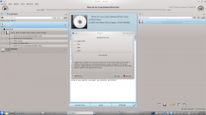
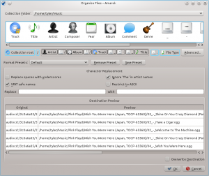
One area where Amarok does excel is in its music importing wizard. It is very simple and full of sensible defaults that makes ripping tracks from a CD super simple. Kubuntu ships with Amarok version 2.3.2.
Dragon Player
Like GNOME’s Totem, KDE’s Dragon Player (version 2.0) is a no fuss video playback application. There really isn’t much to say about this as it is a very feature lean and purpose focused player. I do however have to give it a special mention; I never had a single vsync issue while using Dragon Player (even with my troublesome ATI graphics card). Not even VLC can say the same without some fiddling around in the options menu.
Kontact
Kontact 4.4.6 is KDE’s answer to Microsoft Outlook. It provides e-mail, calendar, tasks, RSS and more by basically displaying a single user interface that joins together KMail, Akregator, KOrganizer and more in a single window. While this is an excellent way to achieve the end result it does unfortunately mean that the user experience suffers a bit when each application chooses to do things slightly different from one another. Again this is one area that I didn’t notice much difference from the last time I used it.
Conclusion (Konclusion?)
This Kubuntu release is so much improved its hard to believe it was done by the same people who have worked on the previous iterations (I mean that as a compliment… somehow ;)). If you’ve been put off by KDE in the past or even if you’re just looking for a modern KDE distribution then I highly recommend checking this release out.
Pros:
- A huge improvement over previous releases
- Lots of refinements that make using it a pleasure
Cons:
- Some of the KDE software (not the desktop) could still use some work
- Plasmas are cool and all but I don’t think they are quite as amazing as the KDE team keeps pushing them to be



Nice complete post. I agree, KDE 4.5 is probably what the team wanted to achieve in the first place, it just took them a lot longer.
I mostly use Xfce & Openbox now but still, since installing Kubuntu with 4.5.1 find myself booting into it more and more often. Thanks for sharing.
Hi, just for the record, KPackageKit is NOT part of KDE SC.
Its a seperate application.
@Chris
You’re correct. I will make the correction above.
Thanks!